Sunday, October 29, 2006

Product Review: Palm Treo 700p and essential accessories

palm treo 700p reviewAfter two years with a Palm 600, I now have a Palm Treo 700p Smartphone.

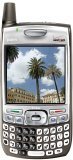
The phone has all the good things we have come to expect from Palm: a high resolution color screen, exceptional battery life, and of course the Palm OS.

What hasn't changed is the weight and thickness of the Palm 700p. This phone is a brick! Couple that with the Seidio Crystal Case that I'm using, and it definitely is a phone that you know is in your pocket. (The case protects it from biffs when it's dropped, absorbing the impact and popping off. Dropping not recommended for long life though).

Given how slim the Motorola Q Phone and the Blackberry 8700 are, why hasn't Palm been more aggressive with slimming the phone down?

OK, that's my only gripe. The Palm 700p is easy to use, and with a memory card, capable of holding a selection of images from iPhoto, four translations of the Bible, several books and some tunes if you wish.

I highly recommend the following accessories:
  • Seidio Junior Desktop Cradle for syncing and charging
  • Seidio Crystal Case
  • Plantronics Bluetooth Headset 640 (This headset is small, discrete, and with the earbud sits in your ear comfortably, and does not fall off -- even when shaking your head or moving quickly. Not recommended for wearing while riding roller coasters though.
  • Missing Sync (for Mac OSX, sorry Windows users!) This amazing piece of software lets me use my Treo 700p with Microsoft Entourage for Macintosh, automatically transfer photos from iPhoto and iTunes. A must-have.

Sunday, October 22, 2006

Change is good, change is inevitable

Change is good: Two weeks ago I participated in a roundtable hosted by Recourses, a management consulting firm that works with service providers in the communications industry.

This particular roundtable (unfortunately, you'll have to wade through the Recourses web site to get to the roundtable page, as the site currently has the misfortune of being coded in frames) was guided by David Baker, and attended by principals from 10 other design firms of 6 employees and under.  It was two intense days of discussion and interaction, with the goal of learning from each other and affecting positive change in our businesses.

And learn we did.  I honestly don't think my view of business, or even the business itself, will be the same.

It's not uncommon in the design field for firms to be unfocused, looking for work from any client who comes along.  But now it's going to be different, we'll be looking for the work we want to do.  Marty Neumeier, whose excellent book, The Brand Gap, explains focus very well.

My epiphany: For all of the positioning work we do for our clients (at BS+Co.), we've never clearly focused on our own positioning; it's been too broad.  But now we have narrowed our focus, and things are going to change, of course for the better.

Change is inevitable: For all the hype that Gilette put into its new Gillette Fusion, it was inevitable that I try it out.  I've been using the same type of two-blade razor for 25 years.  Now we'll see how 5 blades do, and if the signal to noise ratio is justified.

Tags: , ,


Saturday, October 14, 2006

Book Review: LogoLounge3

As reference books go, one of my favorite series is the LogoLounge series, published by Rockport. The authors, Catharine Fischel and Bill Gardner have collaborated on the first two books in the series, LogoLounge 1 and 2. The newest is LogoLounge 3: 2,000 International Identities by Leading Designers (LogoLounge)


Culled from the nearly 37,000 logos submitted to logolounge.com, The LogoLounge books have become a yearly snapshot of the best (and I mean best) of the logos being designed currently (or logos that have been around for a few years, such as Netscape's. This logo in the book was attributed to AOL, but my understanding is that it was designed by a Neutron LLC, a collaborative group headed by Marty Neumeier in 1996).

The book features "portraits" of several identities, in four-page spreads. Some identity portraits are unremarkable, from AOL, Travelocity and others, to the exceptional: The Bank of New York, Sprint and Cameo.

Also featured are one-page summaries of several designers and design firms. These are spread throughout the book, and punctuate it for interest.

From there the book breaks the chosen identities down into many categories( e.g. typography, people, animals, symbols, sports and food to name a few), and is my favorite and the most enjoyable part of the book. The breadth of creativity is superb, and provides ample reference and inspiration for designers and creatives developing and interested in identity development.

The book has a companion web site where you can search the 2,000 logos included in the book. But we'll ask you to buy it to find out how to get there.

Congratulations to the folks from LogoLounge.com on yet another superb volume for my reference library.

Disclaimer: The logo designed by Brian Sooy & Co. for Drum Foundry is included in Book 3 on page 169.

Tags: , , ,

Tuesday, October 10, 2006

Printing old school style

A weekend trip to Nashville allowed me 15 minutes to visit Hatch Show Print (hence the delay in this week's post).

We're talking old, old school. Letterpress and ink, worn metal and wood type for over 100 years. Even with that, they have more cred than many commercial printers.


Their pricing is simple, $1 per color up to three colors, minimum 100 units. Can't beat that, and I'm racking my brain to figure out something for them to print for me.

Digital, schmigital. Gimme ink and paper.