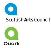
It's old news, but recently Quark unveiled a new logo with more than a striking resemblance to the Scottish Arts Council. (Thanks antipixel for the image, and this quote:)
"Consider it instead a little public service reminder for designers: you’re being paid as much for the quality of your thought as for the actual Illustrator file (or whatever) that you send along at the end of a project. Document your thinking well and present it clearly. You’ll look smarter and you’ll find your ideas are easier to sell."It's alarming, especially as a designer, to understand how easy it is for this to happen. A serendipitous hyperlink took me to the web site of a corporation that has a logo identical to another company that we are associated with. Not similar, but identical. (Their identity will not be revealed to protect the innocent. It's difficult to know which logo came first.)
So the key here is: While our visual vocabulary is similar, thinking different is the key to creating a memorable and compelling identity, yet alone a unique one.
Tags: Branding, Design
No comments:
Post a Comment