Everyone tip-toes around this time of year trying not to spread mis-directed Christmas cheer, (Oops, did I say "Christmas?" I meant holiday...)
But, the presence of Christians (ie, those who celebrate Christmas) in the business world are hard to overlook.
Guy Kawasaki points out that some of the best speakers are found in the pulpit in Evangelism: Eternal Life, Forgiveness, and Operating Systems.
One of my favorite authors and speakers is local businessman John Beckett. He wrote Loving Monday. Instead of grinding it out until Friday and living only for weekends, John saw how his work can be filled with meaning and purpose. The key was integrating his work and beliefs. As a result, both grow - along with his love for Mondays. (You can even read it online).
Nor did it end there... His newest book is Mastering Monday: A Guide to Integrating Faith and Work.
Looking for a different approach this year? I highly recommend these books!
Tuesday, December 26, 2006
Design takes a holiday
The days between Christmas and New Year's day are one of my favorite times of the year, mainly because we close our office and take a holiday.
It's a tradition we began when we formed Brian Sooy & Co. over 11 years ago, and it's not particular to our business. Other local and design firms around the nation follow the same practice. One of the largest employers in the county in which we live is closed.
It will be a working holiday this year, with a press check to attend and time to catch up on invoicing, but it will allow for time to spend with family, to play and to think.
Thinking is so often overlooked, since many designers tend to enjoy doing: designing, creating, making. It's the leisure of unstructured time over these next few days that allow the opportunity for thinking.
Big picture thinking: Where are you headed next year? Where is your design business headed? Are you content with your positioning? Are you content with your client relationships? Are you noticing your employees enough? Are you making it possible for them to do great work?
Mundane thinking: Is our data backed up reliably? How can I synchronize my font library across the network? Will anybody notice if I don't send out a Christmas card?
At any rate, plan well for next year. You'll appreciate it next December, which will be here before you know it.
Merry Christmas and Happy New Year!
Tuesday, December 19, 2006
When designers turn to golf... and toast
Arik Nordby, a designer from Minnesota (near Canada) is the proprietor of Bogey Pro, a very funny site for golf-themed products. Well, funny if you like golf, because golfers are a funny bunch...
It's a great example of a designer creating a successful business designing and selling product and creating a brand. Check out the "Moscow International Golf Club" shirt and the Underachievement Awards, at bogeypro.com
I learned of him and his web site after he purchased an Altered Ego font... Not only does he create well-designed product, he has excellent taste in type.
The products are really humorous, especially if one enjoys golf. Overall, it's well-executed, from copy to visual design.
Another product he created in collaboration with The Onion, are gift boxes. I guarantee they are unlike any other gift box you've ever seen...
Toast, anyone?
Thursday, December 07, 2006
Are designers paid to think, or paid to do?
As designers, are we paid to think, or are we paid to do?
Successful client relationships will be those where the client is aware that we're paid to think, and understand the benefits. These will be the clients who look for their design consultant to lead them.
Some clients may assert that we're paid to do (the same who argue that "We paid for it, it must belong to us." ) It's the work-for-hire mentality.
No doubt about it. We're paid to think. The doing is the execution of how we think, and what we think of, and one can't come before the other.
Worth considering: Lombardi weighs in on the topic if Design vs. Management Thinking. He asks "is design as the new management consulting?" His point? Let's not think too highly of ourselves.
He also asks: What is design thinking?
Saturday, December 02, 2006
Digg for Dummies
Let's see, 11 months into blogging and I realize this: the time to think about what to blog is inversely proportional to the time and energy necessary to running a design firm.
That is, the busier I am with design-related issues, the harder it is to be able to write about them. Too busy doing and not enough time being. Time only to observe and not to reflect.
At that point, Digg becomes a valuable tool for additional observing. (Thanks to Guy Kawasaki). Neil Patel of Pronet Advertising has an excellent overview of Digg, so it can become useful quicker to busy designers.
Anyway, blogging about blogging is boring. You can also read about what other designers who blog write about on Designers Who Blog.
Back to the mines, so to speak. More deadlines to meet.
Thursday, November 30, 2006
Firefox the Microsoft way
Enlightened web surfers use Firefox, don't they?
Now Windows users can share the love, share the joy and benefit from the the best of both worlds. The world needs Microsoft® Firefox.
Thanks to the folks at Drum Foundry for pointing this out.
Now Windows users can share the love, share the joy and benefit from the the best of both worlds. The world needs Microsoft® Firefox.
Thanks to the folks at Drum Foundry for pointing this out.
Thursday, November 23, 2006
Interviewing from both sides of the table
Having been on both the interviewee and interviewer sides of the table, and currently interviewing potential candidates for a design position, I've been thinking about the interview process. Is it just me, or has email made this process a bit too casual?
I'm being particular with my approach to interviewing, and to how applicants present themselves. My approach may not be the same as other firm's, but then again, they're my standards. If you're currently looking for a new job in the design field, here are some points to consider:
Disclaimer: This is intended to make your job search more enjoyable and fruitful. If you get a better position because of what you've read, thank me. Or not.
Tags: design business
I'm being particular with my approach to interviewing, and to how applicants present themselves. My approach may not be the same as other firm's, but then again, they're my standards. If you're currently looking for a new job in the design field, here are some points to consider:
- An employer is not looking for an individual who thinks this is "just a job." Of course, candidates should have plenty of outside interests, so that work isn't everything. However, if the candidate doesn't convey excitement about work and passion for design in the interview, why should an employer think they will convey that for their clients?
- Proofread your resumé. Did you get that? Proofread your resumé. If there is a typo, it goes in the trash. Even if you worked for somebody well-known in the field.
- Be professional. If you don't understand what that means in the design field, please ask someone with more experience than you. The employer needs to be confident that a candidate could represent the firm to a CEO or president.
- Check your ego.
- Remember, the employer is running a design and creative business, not an outlet for your personal expression. Clients hire design consultants to solve their problems and communicate their messages in ways appropriate to their audiences. If a candidate requires personal expression, then perhaps it's time for a hobby such as painting.
- Dress appropriately for the interview. Employers are aware that business dress has become more casual, but you're trying to impress, not show off your fashion sense. If you're not familiar with the culture of the firm, dress better than you think is necessary.
- Read the qualifications of the posting carefully before sending a resumé. If the requirements are "3 to 5 years experience" and you're a recent graduate, it just tells the employer you can't read or pay attention to detail.
- A note sent via the company's contact form via the web site does not count as a cover letter. If it's not stated on the posting or on the website, it is an appropriate way to ask how to submit a cover letter and resumé.
- Always send a thank you letter. Handwritten or typed via snailmail is best. Email is acceptable, but won't impress.
- A few well-designed web pages that include your resumé, some samples of your work, and perhaps your design approach and philosophy are helpful to the interviewer. Not only does it help the interviewer pre-qualify the candidate, it saves the candidate time as well.
- Remember, a candidate not only has to have serious design talent and training, but inter-personal skills and technical knowledge are important. If your list of software skills includes software that the position doesn't require, the interviewer will need to know why those skills are valuable to them.
- Clients hire for how we think and solve problems. An employer will be looking for the same in a potential employee.
- In addition to the above, a candidate also has to fit into the culture of an organization. The smaller the design firm, the more important this is. Likability is a huge factor.
- Expect to be asked to take a behavioral profile, such as a DISC or Meyers-Briggs test. Most likely this request will occur if a candidate is seriously considered for a position.
- Show your best work. Be familiar with the quality, standards of and type of work the firm you are interviewing with does. Showing fewer well-crafted and thoughtfully-designed pieces convey the sense that a candidate knows how to present themselves and their work. Adding some pieces that are average or below-average dilutes the impact of even the best work.
Disclaimer: This is intended to make your job search more enjoyable and fruitful. If you get a better position because of what you've read, thank me. Or not.
Tags: design business
Sunday, November 19, 2006
Ted the expert saves the day
This week has been technologically challenging.
Every design firm needs big bandwidth, and ours is no exception. DSL in our area of Ohio (USA) is provided by Windstream, and due to tariffs, they have a monopoly on phone company broadband.
On the plus side, Windstream has provided exceptional service and have worked diligently to resolve our issues. On the other hand, they are a company that chose a 50's Chevy pickup truck to symbolize their company. My perception of this brand positioning is "as slow and efficient as a US Auto manufacturer..."
I'm not certain that's what they intended.
So to supply our thirst for bandwidth, because we're too far from the central office to get the juicy 6 MB download speed, Windstream suggested installing a second DSL line. Brilliant, if it would work. A Google search led me to the Netgear Dual Wan router, (affectionately known as the FSV124G). This device would create one huge fate pipe by combining two. Or at least load balance the two lines so that when one was busy, the other would balance the load.
Being the fiercely-independent-do-it-all entrepreneurial type, I unpacked it and tried setting it up. About 1.5 hours later, I decided to do the wise thing: call an expert.
Enter Ted, a networking and VoIP expert and consultant.
Ted had it working in less time than it took to unpack the box and set it up. And gently explained to me what I was doing wrong.
Lesson learned: Hire experts to do the kind of work that design firm principals are not good at, even if one is capable of figuring it out (eventually). If your choice is billable work or bragging rights that you "did it yourself," choose the former.
And yes, we now have much faster internet access. And I have one less technology thing to worry about.
Tags: branding, technology
Sunday, November 12, 2006
Color Wars
Color matching is the bane of designers everywhere.
When matching process colors is critical, the EFI Designer edition software, coupled with an Epson Stylus 2200, paper from Red River Papers or the Epson Matte inkjet paper, yields dead-on results. So accurate, that at our last press check, the printer put our proofs in front of us to compare to the press sheets. When I pointed out that these were our proofs, not their proofs, they were quite surprised, a little embarrassed, but interested in how we accomplished it.
But when it comes to matching Pantone colors, especially when showing proofs for brand development projects, it's another story. I have yet to find a system, including our Xerox 6350, that matches Pantone colors accurately
The Adobe software doesn't make it easy, especially Illustrator. By the time one figures out where all of the color management settings are, and how they must match, precious billable time has slipped away. Granted, Adobe Bridge allows for all Creative Suite apps to be synchronized, but Illustrator isn't "smart," in that copying a color match into a new file won't produce accurate results.
Upon reflection, I think the solution would be to specify CMYK (spot to process) colors, and work from there. And in one's spare time, print a sample of all of the Pantone colors, and match to your target color.
And leave plenty of room so that the color matching process doesn't affect the budget!
Tags: design, color
Tuesday, November 07, 2006
Typefaces du jour
Typefaces, like music, come and go. Some rise to the level of classic, and become ubiquitous (not necessarily in that order). Others are seen for a while and reappear from time to time.
Given the number of conversations (with our clients) that have taken place in the last few weeks regarding the role of typography in brand development, I offer these fine typeface suggestions as examples of excellent choices for inclusion as part of the brand development:
Vista Sans (Emigre): a broad range and robust san serif, by Xavier Dupré. It has the traditional "E," not the semi-cursive "E" popular in many Emigre typefaces. Xavier is a fine type designer, an overview of his work is available on Fontshop.com
FF Profile (Fontshop) by Martin Wenzel. Another san serif with a wide weight range, and a traditional style italic. (note the italic "a.")
Apex (Village) by chester. A 6-weight san serif, has a "square" feel to it. Most likely our choice for the new BS&Co identity. Lighter weights will require tracking to close up the letterspacing.
One thing I have noticed is that many contemporary sans serifs, in the light, book and regular weights, often require negative letterspacing for my tastes.
We've used these three typefaces extensively in recent projects, and all have performed well. Avoid temptation, license legally, and enjoy your new typefaces.
Tags: branding, typography
Wednesday, November 01, 2006
Can you say Ugarit?
Today's post on the Logos Blog details the process of creating a new TrueType font for Ugaritic:
A Semitic language written in cuneiform, Ugaritic was in use around 1300 BC in the city of Ugarit in modern Syria. The city and its language was discovered by archaeologists in 1928. Ugarit literature bears some resemblance to parts of the Hebrew Bible, so it is studied by biblical scholars today.
Logos Research Systems decided to to publish digital editions of a dozen Ugaritic texts and grammars. Since Ugaritic was originally written using a stylus on clay tablets, the font designer had to tackle some thorny questions, such as:
Can you say Ugarit? I knew you could.
A Semitic language written in cuneiform, Ugaritic was in use around 1300 BC in the city of Ugarit in modern Syria. The city and its language was discovered by archaeologists in 1928. Ugarit literature bears some resemblance to parts of the Hebrew Bible, so it is studied by biblical scholars today.
Logos Research Systems decided to to publish digital editions of a dozen Ugaritic texts and grammars. Since Ugaritic was originally written using a stylus on clay tablets, the font designer had to tackle some thorny questions, such as:
- How much do you try to emulate the tablets, and how much do you try to emulate later grammars (which often used hand-drawn glyphs)?
- What are the standard grammars, and how do they draw certain characters?
- What shape should the wedges be?
- How tall is each character?
- Do they have a consistent baseline?
Can you say Ugarit? I knew you could.
Sunday, October 29, 2006
Product Review: Palm Treo 700p and essential accessories

The phone has all the good things we have come to expect from Palm: a high resolution color screen, exceptional battery life, and of course the Palm OS.
What hasn't changed is the weight and thickness of the Palm 700p. This phone is a brick! Couple that with the Seidio Crystal Case that I'm using, and it definitely is a phone that you know is in your pocket. (The case protects it from biffs when it's dropped, absorbing the impact and popping off. Dropping not recommended for long life though).
Given how slim the Motorola Q Phone
OK, that's my only gripe. The Palm 700p is easy to use, and with a memory card, capable of holding a selection of images from iPhoto, four translations of the Bible, several books and some tunes if you wish.
I highly recommend the following accessories:
- Seidio Junior Desktop Cradle for syncing and charging
- Seidio Crystal Case
- Plantronics Bluetooth Headset 640
(This headset is small, discrete, and with the earbud sits in your ear comfortably, and does not fall off -- even when shaking your head or moving quickly. Not recommended for wearing while riding roller coasters though.
- Missing Sync (for Mac OSX, sorry Windows users!) This amazing piece of software lets me use my Treo 700p with Microsoft Entourage for Macintosh, automatically transfer photos from iPhoto and iTunes. A must-have.
Sunday, October 22, 2006
Change is good, change is inevitable
Change is good: Two weeks ago I participated in a roundtable hosted by Recourses, a management consulting firm that works with service providers in the communications industry.
This particular roundtable (unfortunately, you'll have to wade through the Recourses web site to get to the roundtable page, as the site currently has the misfortune of being coded in frames) was guided by David Baker, and attended by principals from 10 other design firms of 6 employees and under. It was two intense days of discussion and interaction, with the goal of learning from each other and affecting positive change in our businesses.
And learn we did. I honestly don't think my view of business, or even the business itself, will be the same.
It's not uncommon in the design field for firms to be unfocused, looking for work from any client who comes along. But now it's going to be different, we'll be looking for the work we want to do. Marty Neumeier, whose excellent book, The Brand Gap, explains focus very well.
My epiphany: For all of the positioning work we do for our clients (at BS+Co.), we've never clearly focused on our own positioning; it's been too broad. But now we have narrowed our focus, and things are going to change, of course for the better.
Change is inevitable: For all the hype that Gilette put into its new Gillette Fusion, it was inevitable that I try it out. I've been using the same type of two-blade razor for 25 years. Now we'll see how 5 blades do, and if the signal to noise ratio is justified.
Tags: advertising, marketing, branding
Saturday, October 14, 2006
Book Review: LogoLounge3
As reference books go, one of my favorite series is the LogoLounge series, published by Rockport. The authors, Catharine Fischel and Bill Gardner have collaborated on the first two books in the series, LogoLounge 1 and 2. The newest is LogoLounge 3: 2,000 International Identities by Leading Designers (LogoLounge)


Culled from the nearly 37,000 logos submitted to logolounge.com, The LogoLounge books have become a yearly snapshot of the best (and I mean best) of the logos being designed currently (or logos that have been around for a few years, such as Netscape's. This logo in the book was attributed to AOL, but my understanding is that it was designed by a Neutron LLC, a collaborative group headed by Marty Neumeier in 1996).
The book features "portraits" of several identities, in four-page spreads. Some identity portraits are unremarkable, from AOL, Travelocity and others, to the exceptional: The Bank of New York, Sprint and Cameo.
Also featured are one-page summaries of several designers and design firms. These are spread throughout the book, and punctuate it for interest.
From there the book breaks the chosen identities down into many categories( e.g. typography, people, animals, symbols, sports and food to name a few), and is my favorite and the most enjoyable part of the book. The breadth of creativity is superb, and provides ample reference and inspiration for designers and creatives developing and interested in identity development.
The book has a companion web site where you can search the 2,000 logos included in the book. But we'll ask you to buy it to find out how to get there.
Congratulations to the folks from LogoLounge.com on yet another superb volume for my reference library.
Disclaimer: The logo designed by Brian Sooy & Co. for Drum Foundry is included in Book 3 on page 169.
Tags: design, branding, books, reviews
Tuesday, October 10, 2006
Printing old school style
A weekend trip to Nashville allowed me 15 minutes to visit Hatch Show Print (hence the delay in this week's post).
We're talking old, old school. Letterpress and ink, worn metal and wood type for over 100 years. Even with that, they have more cred than many commercial printers.
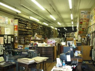
Their pricing is simple, $1 per color up to three colors, minimum 100 units. Can't beat that, and I'm racking my brain to figure out something for them to print for me.
Digital, schmigital. Gimme ink and paper.
Saturday, September 30, 2006
Quick brand comparison: Lego vs. Limited Too
My son has been fascinated by Legos as long as I can remember, and as he has moved into his teens, his interest has moved on to the Lego Mindstorms product.
Given the potential of Lego as a brand and the Mindstorm NXT, I am mystified that Lego just doesn't get it when it comes to creating a strong brand as children get older, especially in the US market. There is prime opportunity to create brand awareness and loyalty through some very simple things that many other companies do, such as branded apparel and accessories, as young boys grow into their teens. The strongest brands create incremental sales and passive marketing through apparel and accessory sales.
One of our summer trips was to Chicago, Illinois, USA – home to a Lego company store. My son wanted to visit the store all summer, only to be greatly disappointed by the total lack of anything that he could buy that showed his affection for Lego. No t-shirts, no baseball caps, nothing. Unless you were an 8-year-old, and maybe there would be something in your size, but one couldn't count on it.
And with the Mindstorm, they still don't get it. I just discovered that the Bluetooth won't work with their release software on an Intel-based Macintosh running Rosetta. Hello! The Intel Macs have been available for over a year before the NXT was released. I was looking forward to the freedom from the USB cable.
Overall, Lego isn't creating a positive end-user experience on-line, in-store or with their product. I foresee more plant closings.
Compare this to Limited Too. My daughter has become semi-obsessed with visiting this store, which isn't so bad, even for a dad. Granted that there were only two fathers and a half-dozen soccer moms in the store while we were there.
This is a great store for pre-teen and tween girls, with none of the objectionable fashions that are featured at other retailers. It's a very positive, pro-girl environment, emphasizing cute and stylish clothes and accessories that really appealed to my daughter (and to the parents – we prefer to guide our daughter in modest dressing, not the ho style). I noticed that the in-store music was all female performers. They've created a great experience.
My daughter can't wait to go back to the store. My son on the other hand, won't want to return to the Lego store. Of course it's all part of growing up. But clearly one manufacturer doesn't understand about creating consumers for life, and the other: it will only be a matter of time before my daughter wants to visit the Limited. Time and a few more inches.
Tags: branding, fashion
Saturday, September 23, 2006
Design Matters bookstore
Amazingly enough, many of the topics we touch on in Design Matters have been written about by more informed and enlightened individuals.
These individuals are so knowledgeable, they have actually written books (instead of simply writing blogs), indicating that someone, somewhere, has deemed their writing as worthy of the expenditure of ink, paper and other resources. Not that some blogs aren't worthy of becoming books.
Hmmm. Will the blogosphere someday replace books? Either way, we appreciate the efforts of everyone who writes.
Anyway, I digress. Please visit the Altered Ego + Design Matters bookstore, and support capitalism, free speech and the creative economy.
Thursday, September 21, 2006
Branding: logos separated at birth
Given that we all have the same 26 characters in the alphabet and the same visual shape vocabulary to work with, it's not unusual to find instances of logos that are similar, and at times identical.
It's old news, but recently Quark unveiled a new logo with more than a striking resemblance to the Scottish Arts Council. (Thanks antipixel for the image, and this quote:)
So the key here is: While our visual vocabulary is similar, thinking different is the key to creating a memorable and compelling identity, yet alone a unique one.
Tags: Branding, Design
It's old news, but recently Quark unveiled a new logo with more than a striking resemblance to the Scottish Arts Council. (Thanks antipixel for the image, and this quote:)
"Consider it instead a little public service reminder for designers: you’re being paid as much for the quality of your thought as for the actual Illustrator file (or whatever) that you send along at the end of a project. Document your thinking well and present it clearly. You’ll look smarter and you’ll find your ideas are easier to sell."It's alarming, especially as a designer, to understand how easy it is for this to happen. A serendipitous hyperlink took me to the web site of a corporation that has a logo identical to another company that we are associated with. Not similar, but identical. (Their identity will not be revealed to protect the innocent. It's difficult to know which logo came first.)
So the key here is: While our visual vocabulary is similar, thinking different is the key to creating a memorable and compelling identity, yet alone a unique one.
Tags: Branding, Design
Monday, September 18, 2006
Pimpin' my... tractor
 So where does a tech-savvy midwestern designer go every September? To the engine show, of course. After all, this is farm country.
Much like a county fair (where all the exhibitors and vendors set up in exactly the same place year after year), it's a combination swap meet and collector's exhibit.
Far removed from the technology-obsessed cities across the country, this show features 20th century tech in the form of hit-and-miss engines, tractors (vintage of course) and all the John Deere paraphernalia you want at reasonable prices.
My favorite: the "slightly modified garden tractor," with 16 engines. Top that, Jesse James or Orange County Choppers. Designed to impress to say the least. Well, if you're into that sort of thing.

Tuesday, September 12, 2006
demotivation as motivation
It's time to gather some co-workers and snipe some posters in the corporate offices. Despair.com continues to inspire with its witty and incisive parodies of motivational posters and propaganda,* I mean paraphernalia.
John Maxwell's leadership seminars, Maximum Impact, most recently the 360° series, referred to the work of despair.com as a way to instill leadership principles and to motivate those attending.
Despair.com offers such insights such as
*a synonym for propaganda is disambiguation
Tags: design, leadership, motivation
John Maxwell's leadership seminars, Maximum Impact, most recently the 360° series, referred to the work of despair.com as a way to instill leadership principles and to motivate those attending.
Despair.com offers such insights such as
Ignorance It's amazing how much easier it is for a team to work together when no one has any idea where they're going.and
Get To Work You aren't being paid to believe in the power of your dreams.If you don't find these hilarious, you must be a manager or executive. Lighten up!
*a synonym for propaganda is disambiguation
Tags: design, leadership, motivation
Saturday, September 09, 2006
Leading from the middle
It seems that many of my friends and close associates have corporate jobs, and that even the seemingly most enlightened organizations, despite their best efforts, maintain the chasm between management thinking and personnel who execute the projects.
Let's be honest: No matter where you are in an organizational structure, at some point one or more of these theories has crossed your mind. C'mon, you know it's true.
Over 25 years, having spent a grand total of 9 months working in a major corporation, these are the theories that I was reminded of:
Disclaimer: Theories offered "as is." Use at your own risk. The use of protective eyewear, gloves and hazmats suits are highly recommended when appropriate. Do not point these sharp observations at your eyes. Your experience may differ, please use these theories with caution and discernment. Design Matters accepts no responsibility for any consequential actions associated with the implementation, repetition and or dissemination of these theories.
Let's be honest: No matter where you are in an organizational structure, at some point one or more of these theories has crossed your mind. C'mon, you know it's true.
Over 25 years, having spent a grand total of 9 months working in a major corporation, these are the theories that I was reminded of:
Given a fixed amount of resources, no two projects can occupy the same space/time continuum and be successfully delivered on time.Personnel shortages, constantly changing objectives, scope creep and lack of focus contribute to this one. Those with the ideas need to be talking with those who execute. I think that's how Chrysler turned it around at one point.
The best work is done is spite of management.An individual's personal desire to excel and succeed will outlast the policies and procedures that often are in place, and that seem to hinder progress and improvement.
It's easier to ask forgiveness than permission.Sometimes, you just have to get it done. And when you do get it done, sometimes you'll get called on the carpet for doing so. Beg for mercy, then point out how it will benefit the project or company. If you were right, resist the urge to say "I told you so." Thank you, Grace Hopper.
Disclaimer: Theories offered "as is." Use at your own risk. The use of protective eyewear, gloves and hazmats suits are highly recommended when appropriate. Do not point these sharp observations at your eyes. Your experience may differ, please use these theories with caution and discernment. Design Matters accepts no responsibility for any consequential actions associated with the implementation, repetition and or dissemination of these theories.
Saturday, September 02, 2006
Labor Day Jocularity
It's Labor Day weekend, and the staff of designMatters isn't working too hard, and for the most part we're not thinking about work, business or design.
So for a break from the race, may I recommend some light reading from... Dave Barry. As keen an observer as such luminaries as Seth Godin, Dave has been at The Miami Herald since 1983. He has won a Pulitzer Prize winner for commentary, and writes about issues ranging from the international economy to exploding toilets. Really.
His quotes include:
So put down that business book and lighten up this weekend, get your own Dave Barry book and have a good laugh. At someone else's expense, of course.
So for a break from the race, may I recommend some light reading from... Dave Barry. As keen an observer as such luminaries as Seth Godin, Dave has been at The Miami Herald since 1983. He has won a Pulitzer Prize winner for commentary, and writes about issues ranging from the international economy to exploding toilets. Really.
His quotes include:
"I can win an argument on any topic, against any opponent. People know this, and steer clear of me at parties. Often, as a sign of their great respect, they don't even invite me."Dave coined the term "WGU" (Whirring Grinding Unit) in Dave Barry in Cyberspace. (that refers to your computer, by the way, unless you use a Mac, with the possible exception of the Titanium PowerBook, which is a whining groaning unit.)
and
"You can only be young once. But you can always be immature."
and
"The only really good place to buy lumber is at a store where the lumber has already been cut and attached together in the form of furniture, finished, and put inside boxes." (Taming of the Screw)
So put down that business book and lighten up this weekend, get your own Dave Barry book and have a good laugh. At someone else's expense, of course.
Friday, August 25, 2006
Definition of "designer"
I don't know why our field seems so curiously self-obsessive.
From AIGA's Communique newsletter:
Again from AIGA:
What is curious is that the US Department of Labor's definition seems much more current on the Bureau of Labor statistics web site. It's broad and inclusive and recognizes many aspects of what a graphic designer does.
All in all, it's a great time in which to be a graphic designer. Don't worry so much about your software skills. Instead, learn how to think. Then it won't matter how you're defined, you'll know how to solve problems, and your clients will recognize that and value you for it.
Tags: Design
From AIGA's Communique newsletter:
Promoting a new standard definition for “designer”Stated definition: "Design or create graphics to meet specific commercial or promotional needs, such as packaging, displays, or logos. May use a variety of mediums to achieve artistic or decorative effects." (Last updated in 2003).
AIGA testified this month before the commission on redefining the standard occupational classifications for “designer” used by the U.S. government in its economic research. This is another step in an effort that AIGA has pursued consistently for ten years. The occupational classification for designer is at least two decades old and captures the functions of a designer prior to the introduction of the Macintosh and securely anchored in the realm of commercial artist.
Again from AIGA:
The U.S. Department of Labor’s contractor for the Occupational Information Network (O*NET), the government’s database on occupational characteristics, is conducting a survey to gain a sense of the relevance of the current definition. The survey will be sent to 80 opinion leaders within the profession, and their responses will govern the future definition. The definition is important to designers, since it governs both the literature about the profession that the government issues, but also influences the economic data collected about the profession.Milton Glaser weighed in last year, with a presentation at the AIGA conference, touching on on role and responsibilities as designers. I'm certain he wasn't thinking of a definition the government would use in establishing criteria for economic data.
What is curious is that the US Department of Labor's definition seems much more current on the Bureau of Labor statistics web site. It's broad and inclusive and recognizes many aspects of what a graphic designer does.
All in all, it's a great time in which to be a graphic designer. Don't worry so much about your software skills. Instead, learn how to think. Then it won't matter how you're defined, you'll know how to solve problems, and your clients will recognize that and value you for it.
Tags: Design
Wednesday, August 16, 2006
Behind every [typeface or thing*] there's a story
Fresh back from TypeCon 2006 in Boston, MA (USA): it's the place to hear the stories behind your favorite typeface. Check out the blog and flickr site (1,243 photos) if you're interested.
Major themes in retrospect: type as image(1), combining type and image(2), type in education(3), and some really geeky stuff(4) thrown in to round out the weekend. Please refer to this paragraph as your legend.
Kit Hinrichs of Pentagram opened the sessions on Friday morning, showing slides from the Pentagram archives of Type as Art(1). Many of the examples have been shown in books and exhibitions, but it's always refreshing to hear the stories behind them from a master designer.
Unfortunately Robin Williams couldn't attend due to the state of airline travel, but plenty of copies of her new book, Sweet Swan of Avon were available.
Nick Benson of The John Stevens Shop detailed his involvement in the stone carving on the new World War II memorial.
Friday included some very interesting and engaging speakers, but the beautiful weather encouraged some exploration of the city. Nancy Skolos and Tom Wedell(2) followed some well-received 20-minute type-related presentations, and Font Embedding and the web(4).
Two major figures of 20th (and the present century) type design were highlighted: W.A. Dwiggins and Adrian Frutiger.
the last presentation I was able to attend was by Mark Jamra of TypeCulture.(3) Mark's presentation reminded me of how accidents and experimentation are critical to finding new shapes and forms in every aspect of design work.
For the type-obsessed, whether a lover of type, user of type or creator of type, TypeCon is a must to attend. See you next year in Seattle!
*Tyepfaces are things, not pictures of things
Tags: Design, Type, , Typography
Saturday, August 05, 2006
The death of the apostrophe

The Apostrophic Menace
Did you see the original Stars Wars? Did you see the wrong apostrophe in the opening text that receded, in glorious faux perspective, into the distance? It was subtle, and if you did, you can quit reading and go order some type from Altered Ego Fonts. Oh, everything was spelled correctly (I’m certain they proofed that at least) but they became lazy in the punctuation. Need more clues? Think hard, you had to have seen it. Most people are so used to seeing them they overlook them.
What, do you ask, is the “wrong apostrophe?” It’s like the wrong trousers, such as what Wallace was stuck with when he rented a room to a penguin. Missed that one too? Well, go to the video store tonight, and pay attention here now (especially PC users — it’s easier to do this correctly on a Mac). It’s what appears when you type the apostrophe key next to the return key on your keyboard. You weren’t expecting a curly apostrophe (or typographer’s apostrophe) to come out automatically were you? If you’re not careful, or your preferences aren’t set correctly in your layout / drawing/ word processing program of choice, you will see the ASCII apostrophe appear on your screen, and eventually make its way to your final piece.
George Lucas spent over $120 million dollars to create Star Wars: Episode I, yet failed to hire a type director. Even watching VH1, I see a glaring example of inattentiveness to a basic typographic glyph that appears everywhere, namely the apostrophe. You can’t make a contraction, indicate the possessive, or even write rock ’n’ roll without the apostrophe.
Yes, it’s a pet peeve. I’ve seen the ASCII apostrophe on signage in the world-renowned Rainbow Baby and Children’s Hospital in Cleveland, Ohio; in magazine ads in Graphic Design: USA and Publish, and in TV commercials more times than I can count (Especially Daimler-Chrysler commercials). It’s kind of a game now, to find these incorrectly typeset apostrophes everywhere I go. Even online, typing typographer’s quotes or apostrophe requires HTML code.
Shall I succumb to the irrelevant?
By now you’re thinking that I ought to get a life, but bear with me (We type designers start from the details up). You can make your typography more beautiful (and professional) in the process. It’s quick, it’s easy, and it makes the world a better place. Really. I suspect there are a lot of people that are secretly annoyed by this, but are too embarrassed to admit it.
You don’t have to watch television for very long, or read more than one magazine, without seeing an apostrophe standing rigid in some possessive phrase or contraction.
I suspect much of the problem is due to the use of PCs in typesetting and layout, and the difficulty of typing anything other than what appears in the first two levels of the keyboard. PCs seem to be used in broadcast media, you’ll see a lot of the ASCII apostrophes on television.Apostrophes from STF Veritas and Trebuchet; Serif apostrophes from AEF Veritas and Adobe Garamond; sans serif apostrophes from AEF Chevron and Azkidenz.
So what to do about it? The obvious solution is to buy a Macintosh computer (I am not kidding). You can achieve this degree of typographic sophistication on either platform. First, study this picture carefully: An ASCII apostrophe bears some resemblance to a tent stake, and in most cases and is rigidly vertical. The proper apostrophe will be tapered and set at a slight angle in a sans serif font, and resemble a period with an angled or curling tail descending from the bottom in a serif font. Type a comma, and you’ll more than likely be looking at something similar to what the apostrophe should look like.
Each font has two apostrophes in character slots (at least the professional fonts do, amateur fonts, the kind you download for free from the one-million-and-one-free-font sites, may be missing one, or both!) There is the ASCII apostrophe, which is set by typing the apostrophe key, and what has become known as the curly apostrophe, or smart quotes. Preferably it is called the “typographer’s apostrophe.” On the Mac, it’s set by typing the option-shift-right bracket key. In Windows, it’s set by typing alt+0146 (on my PC it doesn’t appear until I release the ALT key).
The major drawing and illustration applications, and MS Word offer simple preference settings to ensure that your apostrophe is set correctly. In InDesign, go to Preferences: Type: “Use Typographer’s Quotes.” In Freehand, go to File: Preferences: Text, and there is a check box that allows you to not only use “Curly Quotes,” but to select your preferences for US or European or other country-specific settings. Microsoft Word has a setting under Tools: AutoCorrect: Autoformat. In Quark Xpress you can set the preference for “Smart Quotes.”
It’s a little thing, but simple to correct. After all, for a typographer, the difference between typesetting and fine typography is in the details.
Stand firm. Be free. Make the world a more beautiful place through typography. And above all else, don’t be afraid to admit that that you’re bothered by ASCII apostrophes. The future of typography is in your hands. . .
Tags: Design
Disclaimer: Due to the finicky nature of browsers and HTML editors, and ASCII apostrophes in this article are unintended and we will correct them if found!
Thanks to the readers who corrected my grammatical mistakes, which involved of course the apostrophe in the wrong place, rather than the wrong apostrophe.
Wednesday, August 02, 2006
Saying thank you
When was the last time you wrote someone a thank-you note? I don't mean emailed a thank you, called someone and said thank you -- I mean took out some personal stationery, and wrote a thank you?
I recall hearing Doyald Young mention the things he heas learned in his many years as a design professional, author and instructor. One of them was "the importance of a well-written thank you note." (and BTW, Doyald is the most conscientious and gentlemanly man of letters i have ever met.)
It's an excellent practice to follow in a design business. It's not a ground-breaking marketing technique, but shows clients and those who contribute in any way to a the success of a business that they are appreciated. It also speaks to your character.
With all the hype about marketing, the lifeblood of a small business (ie micro business of under 10 employees) is referrals. Any designer should be sending out thank you notes after any referral. Anyone who interviews should send out a thank you after the interview (Here's an interviewing secret we have. If we don't get a thank you, most likely you will be eliminated as a potential candidate for a position in our firm).
Don't overdo it, or it will be seen as insincere. A well-written and timed thank you is a pause and a breath of fresh air for the recipient in the hectic pace of business.
With that, to those who choose to read this blog out of the millions that are available... thank you.
Sunday, July 23, 2006
Review: Tifosi Tyrant Sunglasses
 With summmer here, design takes a backseat to play (although it seems like I'm working more, not less). Sunglasses are required when cycling, inline skating, golfing and during the course of never-ending yardwork.
My chance encounter with a Tifosi Optics display at Marty's Cycle Center was timed perfectly for the season.
Described as "enthusiastic eyewear," Tifosi sunglasses are an amazing synthesis of design, technology, materials and aesthetics. And they are surprisingly affordable.
My Tifosi Tyrants (last year's catalog evidently, the Pavé is the current replacement but uses similar lenses), set me back about $50.00 US. Included is the frame, three lenses (clear, smoke and all-condition red), and a hard case and soft bag. The AC Red cuts glare and heightens contrast better than any amber or brown lenses I've ever used.
I personally think these Tifosi Tyrants are better than my Oakley Duval Pro M Frames for a variety of reasons (and $150.00 less!).
- They are face-hugging (meaning they wrap around the face comfortably and block light from the side -- the M Frames do this but have HUGE lenses.
- The frames fold (granted the regular M-frames fold, but are bulky when folded)
- The bow in the temples is just enough to curve around a helmet strap, yet fit within the foam of my Nolan and Fulmer motorcycle helmets
- They vent better
- The materials are more durable than the plastic M-Frames. Sweat has corroded the finish on the M Frame
I've found the AC Red lenses are perfect for the golf course, cutting the glare of the sun while increasing contrast to make the ball more visible. I'm close to making these lenses permanent in this frame instead of swapping them out all of the time. Tifosi's are affordable enough for sunglasses aficionados to own two pairs.
The case is an adequate hard case, although there is a danger of scratching the lenses when loading them in and out of the built-in lense holders.
Kudos to Tifosi (a US company) for excellence in design!
You can buy Tifosi sunglasses at Amazon of course. Not that I'm suggesting that you buy them there, but it does help me to afford the other pair...
Disclaimer: I am not affiliated with Tifosi, but am of course pointing out an example of design excellence.
Tags: design, reviews
Tuesday, July 18, 2006
Garmin Nuvi 350 Personal Travel Assistant improves with age (and updates)
Once again, we are amazed with the Garmin Nuvi 350. This GPS/Travel assistant gets better with updates, especially the recent Garmin Nuvi 350 software update adds a load of features (that aren't necessarily indicated in the official list of updates):
Updating was simple, even on the PC (Hello Garmin, Macintosh support would be a good idea), although even if the user doesn't read the email carefully, one tends to land on the WebUpdater page, and not the software download page.
The interface is still easy to read and navigate, especially the trip details screen. It shows average speed, max speed, total time, stopped time and other indicators, both in a numeric and visual display.
A simple tap on the screen highlights whatever you've touched: roads, cities and other information.
This travel assistant is so simple to use. I highly recommend it. (And if you're interested in buying one, might I recommend Amazon for the Garmin Nuvi 350.
- Instead of an arrow, the icon for your vehicle is a car. Delightful, my wife loved that!
- Your indicated path is much wider and easier to see onscreen
- Voice indicator to turn seems to give slightly more warning before you need to turn
Updating was simple, even on the PC (Hello Garmin, Macintosh support would be a good idea), although even if the user doesn't read the email carefully, one tends to land on the WebUpdater page, and not the software download page.
The interface is still easy to read and navigate, especially the trip details screen. It shows average speed, max speed, total time, stopped time and other indicators, both in a numeric and visual display.
A simple tap on the screen highlights whatever you've touched: roads, cities and other information.
This travel assistant is so simple to use. I highly recommend it. (And if you're interested in buying one, might I recommend Amazon for the Garmin Nuvi 350.
Saturday, July 08, 2006
The common sense computer keyboard
Look down. If you're reading this at a laptop computer, your keyboard is centered nicely in front of you, and when you type, your arms are comfortably in front of you, and the monitor is centered in your field of vision.
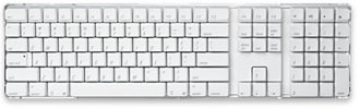 If you're reading this at a desktop computer, your keyboard is nicely centered as well, except that the keys that you use 99% of the time are offset to the left (with some arrow keys and number keys to the right.
Of course, that forces your hands and arms to shiflt left, making it very uncomfortable to type.
Years ago (pre-OSX), Autodesk made a keyboard called the Switchboard. Each section could be moved to the user's preferred position. It was an elegant design, and an excellent example of technology adapting to the user, rather than the user adapting to the technology.
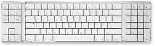 Apple, Logitech, Macally, or even Kensington have overlooked the needs of the users. I would venture that the majority of users wouldn't mind the arrow keys on the left, or even the number pad, as long as the alph keys are centered so that the keyboard is easy to use.
I know, I know... I should design one and file for a patent. Maybe that's not such a bad idea. I've got the idea... Anybody with some spare cash and a desire for manufacturing?
Tags: design, computers, technology
Saturday, July 01, 2006
Addicted to design
To feed your addiction to design, here are some web sites that will feed that addiction, that offer the opportunity of serendipitous discovery and delightful surprise:
Design Addict: Products and the designers who create them. refresh the page for a cornucopia of different objects and people.
Net Diver: design culture and new media portal. Be sure to visit the toolbox.
LogoLounge: Everything logos... subscribe to have access to the 36,000+ logos referenced on the site.
Jewelboxing: An alternative to the catalog-based DVD cases we all see.
InHabitat: forward-thinking design and style.
Tags: Design
Friday, June 30, 2006
So, how 'bout that net neutrality?
If I walked into the local pub in the city where I live, and sat down at the bar, I'm wondering about the blank stares I would get if I asked the guy sitting next to me, "So, how about that net neutrality thing?"
I'm positive the entire bar would go silent, and barring the presence of one of the members of the local computer users group, nobody would say anything. It would be crickets.
It wouldn't hit them until they want to play Neopets, or visit iTunes, or Nascar. If you're reading this, it will affect you.
As proposed, the new Telecommunications Act would have a negative effect on my business. Alex Jucabenta states on Crains Cleveland Business:
The proposed restriction of access and favoritism will have cascading economic effects. Enacting this legislation will create an uneven playing field for thousands of businesses both in the US, (and of equal importance) and in the global economy.
While referred to as "net neutrality," this amounts to and internet censorship and discrimination in many ways by both public and private concerns.
Close to 80% of businesses in the US are small businesses. The growth and success of many of these businesses are related to their unencumbered use of the internet for which they already pay fees to these telecom and cable companies.
There seems to still be time to amend the Telecommunications Act in the Internet Freedom Preservation Act of 2006" (S. 2917).
You or I cannot compete with the lobbyists who are plying Congress with money and favors in order to gain an unfair competitive advantage. The Internet was designed to be a free and open medium where this blog can compete with blogs that have really meaningful content (as if!).
The Internet is where US citizens practice freedom of speech daily. Are we willing to allow Congress to suppress that freedom? I support Net Neutrality, please join me if you haven't already.
Tags: internet, blogging, technology, politics
I'm positive the entire bar would go silent, and barring the presence of one of the members of the local computer users group, nobody would say anything. It would be crickets.
It wouldn't hit them until they want to play Neopets, or visit iTunes, or Nascar. If you're reading this, it will affect you.
As proposed, the new Telecommunications Act would have a negative effect on my business. Alex Jucabenta states on Crains Cleveland Business:
"Congress has the power to reshape the Internet as we know it and the results of which may not be to the benefit of the consumer.Will enough of us step up to prevent the Internet from being censored by large telecos and cable companies and those willing to prevent the free and unfettered exchange of information and innovation?
As it now stands, most users connect to the Internet via some sort of wire connected to an Internet service provider. Thanks to the Federal Communications Commission, regulations that required telecom companies to provide open access to the Internet were removed last year."
The proposed restriction of access and favoritism will have cascading economic effects. Enacting this legislation will create an uneven playing field for thousands of businesses both in the US, (and of equal importance) and in the global economy.
While referred to as "net neutrality," this amounts to and internet censorship and discrimination in many ways by both public and private concerns.
Close to 80% of businesses in the US are small businesses. The growth and success of many of these businesses are related to their unencumbered use of the internet for which they already pay fees to these telecom and cable companies.
There seems to still be time to amend the Telecommunications Act in the Internet Freedom Preservation Act of 2006" (S. 2917).
You or I cannot compete with the lobbyists who are plying Congress with money and favors in order to gain an unfair competitive advantage. The Internet was designed to be a free and open medium where this blog can compete with blogs that have really meaningful content (as if!).
The Internet is where US citizens practice freedom of speech daily. Are we willing to allow Congress to suppress that freedom? I support Net Neutrality, please join me if you haven't already.
Tags: internet, blogging, technology, politics
Friday, June 16, 2006
Design that touches the heart
A new online exhibit launched today, entitled Design that Touches the Heart.
The preface to the exhibit makes a good point: will your design touch the heart?
That's why we ask every week -- In the end, will your design matter?
Enjoy the show.
PS: the show is powered by autoviewer (from airtight interactive, makers of the excellent simpleviewer).
A design legend: Viktor Schreckengost
You may not be aware of the impact that Viktor Schreckengost has had on products you use today, but his 20th century design has inspired many designers with his human-focused design.
The Cleveland Museum of Art is set to launch an exhibit of his work and his influence.
If you can't make it to Cleveland for a visit, I encourage you to visit his foundation's web site, and marvel at the depth and breadth of his influence on contemporary design. This man is a true design genius.
Saturday, June 10, 2006
web browsers: market share vs. actual use
I've always wondered about the statistics one reads about market share of web browsers. Note the use of Firefox by readers of this blog:

On the other hand, IE users make: up the majority of visitors to Brian Sooy & Co.:
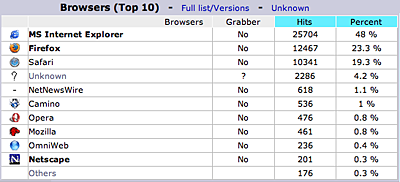
Thanks to all who read Design Matters, no matter what browser you are using.
Tags: blogging
The semi-definitive guide to entrepreneurship in northeast Ohio
Lately the buzz in all of northeast Ohio is about entrepreneurship. Higher education institutions are creating degree and certificate programs to teach it, incubators are funding it, the media is talking about it, business and civic leaders want their communities to include it, people like me are living it. And of course, many people are struggling to spell it correctly.
Regional leaders, pay attention: Guy Kawasaki has given us some insights on how to draw attention away from Silicon Valley. (thanks Guy!) Or as he says, "kick their butt."
If you weren't born with it, you can learn it: Many of the region's higher education institutions offer programs in entrepreneurial studies:
Take the quiz to see if you are genetically inclined to be an entrepreneur.
Capital, pre-seed, seed, angel, venture capital: Whatever flavor of cash you might need, these organizations can assist. Oh, and bring your business plan. A real one, that shows ROI. These organizations also offer business support.
Need direction? I speak with many business owners who are so engaged in the day-to-day that they have no strategic plan or any idea of where they are headed with their business.
- GLIDE and the new Entrepreneurship Innovation Institute of Lorain County Community College can help too.
- For high-level strategic realignment, visit Mills-Scofield LLC.
Of course, we don't have great weather year-round. But the people are nice. Really nice.
If you know of more resources for the northeast Ohio entrepreneur community, contact me, and they will be included in the guide.
Tags: entrepreneurship, entrepreneurs
Monday, June 05, 2006
The value of design
Can design increase your business?
Of course, we've always thought so, but now there's proof: The Design Council has created a web site called the Value of Design Factfinder.
The site's purpose is to "To find evidence comprehensively proving the importance and value of businesses using design."
From our observations, it's been evident that design is more highly valued in Europe, and the study that the Design Council commissioned seems to support that.
The site includes a section entitled "What is Design." It states "Design is everywhere -- and that's why looking for a definition may not help you grasp what it is."
Well said.
Tags: Design, creativity
Saturday, May 27, 2006
Skeet shooting in the dark
Recently I was asked to design a logo for a non-profit organization, and the challenge at this point is to define the problem, more than it is to create the solution.
The project is still ongoing (it's pro-bono, so ostensibly I can take the time I need, rather than meet a short deadline). But identifying visual symbols that will relate to the concepts that the organization wants to portray has been quite difficult.
To this point, I've shown two concepts, and neither were what the client is looking for (The first was, but once they saw it, decided against it). It's a classic "I'll know it when I see it scenario." I call it skeet shooting in the dark.
As a designer, it's critical that we are able to deal with ambiguity. We need to be able to invent meaningful symbolism merely than create surface decoration.
Over 20 years ago I formulated my General Theory of Design: "Design consists of creating things for clients who may not know what they want, until they see what you've done, then they know exactly what they want, but it's not what you did."
Thankfully in my experience, the antithesis of the Theory has been true in most instances: "Clients who know what they want will provide a design brief, and evaluate all designs based upon that brief."
Regardless, (and this is where leadership meets design) those for whom we work expect us to lead them. That's why they hire us!
The solution to the ambiguity problem seems to be time and concentration. Once I find that the assignment has turned into a skeet shoot, it's time to think about it in a completely different way.
Maybe I do need to assign it a deadline. There's nothing like a deadline to inspire!
Saturday, May 20, 2006
The creative economy - design is king!
The business world is taking notice (again). They call it innovation. We call it design. In the end, everybody benefits from the influence of good design.
Christina De Paul recently spoke at the Akron Roundtable, which is always on WKSU (one of the best classical radio stations in the world, IMO).
Christina De Paul is the Dean of Corcoran Gallery of Art. Her topic, The Creative Economy, laid out a convincing argument for the value of design in our economy in every aspect (this is spite of her flat and unemotional delivery – pinch yourself a couple of times if you decide to listen to it).
Designers are on the leading edge of the innovation economy. Innovation technology, the synthesis of technology and design for users, will continue to be and is the competitive advantage that the most insightful businesses will use.
Tags: design, economy, innovation, art
Saturday, May 13, 2006
Leaders are those who recognize it
Are leaders born, or can you make the decision to become one? Whether your view is from the bottom up, the middle or the top – It's clear that your decisions make the difference.
Last week the staff at Brian Sooy & Co. attended 360° - The Measure of a Leader, sponsored the Maximum Impact organization. I'm not sharing my opinions here, but my observations on what was shared. Here are a few highlighted points that we learned:
- You have a leadership role and responsibilities, no matter where you are in an organization. You may not recognize it.
- Don't confuse leadership with a strong personality
- Wide leaders make wise decisions and then manage them (A key tenet of John Maxwell, founder of Maximum Impact.)
- A leader needs to know how to deal with ambiguity
- A leader must be a creative thinker – anticipating needs and thinking beyond perceptions
- A leader is a steward of equipment and resources
- Behavior and performance is more important that words
- A great leader is aware of the big picture and the details (the forest and the trees)
- The most relevant: Learning to lead yourself is the place to start.
Of note: One of the presentations used posters from Despair.com. Despair.com is a series of demotivational products, and is a well-executed parody of the success posters genre.
If you look through the posters at the web site, there is a poster that addresses every major leadership point presented in the 360° simulcast. How brilliant is that!?
Don't despair. Every designer can be a leader. Now get back to work.
Tags: leadership, stewardship, performance, success, failure
Saturday, May 06, 2006
From Parchment to Postscript
In 2004, my family and I attended a fascinating exhibit entitled From the Dead Sea Scrolls to the Forbidden Book: A History of the Bible.
Unfortunately, the exhibit is no longer on display in that form, and it seems that information about the exhibit can now be found at Ink & Blood.
If you're really interested in seeing fragments of the Dead Sea Scrolls, an exhibit is currently mounted at the Maltz Museum of Jewish Heritage entitled Cradle of Christianity: Treasures from the Holy Land. this exhibit sheds light on Christianity’s earliest days: from its emergence against the background of Jewish society in the land of Israel during the 1st century, to its development alongside Jewish communities over the following six centuries.
While the actual fragments of the scrolls that we saw were about the size of a quarter (why bother?), the most fascinating were the examples of Bibles on display from the 10th to the 20th century (The Lunar Bible). Perhaps if you have a keen interest in Christianity, historical book design, archeology, or biblical history, these exhibits would fascinating.
The stories of the men who were killed and persecuted for translating and printing the Bible was very moving, and had the most impact on me.
At this same time, I was completing the design of the Lucerna typeface, commissioned by Tyndale House Publishers for the Second Edition of the New Living Translation Bible.
What struck me the most as I stood looking at the Bibles, reading the stories of the translators, and considering their impact on history – is that nobody was trying to kill me (that I know of) or persecute me (other than the left-wing side of the political spectrum) for contributing to publishing a Bible.
It seemed to me to be a strange culmination of events: I had purchased my first Macintosh (The SE30) in 1990, and released my first typeface intended for Bibles in 1995 (Veritas). Seven years later, I began Lucerna, and the first Bibles typeset in it were released in 2004.
It's difficult to describe the sensation I had while standing in the middle of all this history. The Lucerna Project was significant both personally and professionally, and I am aware that I have been given the opportunity to contribute to the history of the Bible. But why me? I'll always be grateful for the opportunity.
Perhaps the next chapter of the exhibit could be called From Parchment to Postscript...
Tags: Bible, Christianity, type design, Veritas, Lucerna
Saturday, April 29, 2006
Inspired by Steve Jobs and Apple Computer
Last year Steve Jobs gave a thoughtful commencement address at Stanford University. I highly recommend that you read it:
He's proved that a company doesn't have to be the size or scope of Microsoft, as long as it's focused and creates products that are preferred by its customers.
And although he's surrounded himself with product designers and those capable of executing the vision he has set forth, it's largely in part to him that Apple has enjoyed this success. He is the quintessential entrepreneur and business leader.
Truly remarkable. Thanks Steve!
Steve Jobs Stanford Commencement AddressIn addition to being a college dropout, he's been fired from the company he started, and been diagnosed with cancer. In spite of that he says:
"Again, you can't connect the dots looking forward; you can only connect them looking backwards. So you have to trust that the dots will somehow connect in your future. You have to trust in something — your gut, destiny, life, karma, whatever. This approach has never let me down, and it has made all the difference in my life."How long ago do you think that he started the strategy that has resulted in the iPod, iTunes and now the Intel-based Macs? (A brilliant strategy. How long before corporations see the value of moving to the Macintosh platform?)
He's proved that a company doesn't have to be the size or scope of Microsoft, as long as it's focused and creates products that are preferred by its customers.
And although he's surrounded himself with product designers and those capable of executing the vision he has set forth, it's largely in part to him that Apple has enjoyed this success. He is the quintessential entrepreneur and business leader.
Truly remarkable. Thanks Steve!
Wednesday, April 26, 2006
A day in the life of a designer
5:30 AM – Awake, hit sleep button twice (10 minute intervals) despite daily resolution to get out of bed when alarm first goes off. Entrepreneurs are supposed to have drive and boundless energy.
6:20 AM – Downstairs. Read Romans 4, NLT.
6:30 AM – Son comes downstairs, asks if I can get a kickstand for his bike.
7:20 AM – Leave for client meeting, drive 35 mph in rush-hour traffic for 10 miles or so. What are these people doing?
8:30 AM – Client meeting regarding web renovation project. Find bug while demoing web software. Argh.
9:30 AM – Leave for office, see bike store. Go for coffee, wait for 30 minutes until store opens. Call new client and manage projects via cell phone.
10:00 AM – Bike store opens, buy kickstand.
11:00 AM – Arrive back at office, after picking up donated items for Second Harvest Food Bank of North Central Ohio silent auction event.
11:15 - 1:00 PM – Debug web site, work in Windows (urgh), quote projects, catch up on projects in house
1:00 PM – Lunch with staff
1:30 PM – Back to desk. On phone until 3 pm. Write copy for project until 4 pm.
4:00 PM – Last minute phone call. 5 minute exit meeting with staff.
4:15 PM – Son arrives at office after drum lesson, to be taken to baseball practice.
5:00 PM – Baseball practice. Manager is out of town, I pretend to know what I am doing and run practice.
6:30 PM – Practice ends. Go home and catch up with family.
7:30 PM – Help son install kickstand.
9:00 PM – Time to work on new font release. Parker Funky has been in the works for at least 5 years. Where does the time go?
10:00 PM – Time to sleep. Wash, rinse, repeat.
Tags: graphic design
Saturday, April 15, 2006
reflecting on my paper clip collection

Open your desk drawer, and most likely you have a collection of paper clips – those you bought and the paper clips you pull off of the papers that come into your office every day.
Frank McClung at BLANK has a thoughtful blog about paper clips and the symbolism that has become associated with them, and it reminded me that I have a paper clip collection.
That is, I thought I had a paper clip collection. What I really have is a motley assortment of paper clips folded up in a piece of paper, since I seem to have a peculiar fascination with this twisted piece of wire. My assortment includes an Ezeon Paper Clip (lower left), a Nifty (upper left), and various size classic GEM paper clips.
What fascinates me about paper clips is that they are an innovation our of the industrial revolution – when it became possible to bend wire using machinery in a cost-effective manner:
Why weren't bent-wire paper clips marketed earlier? According to Petroski, "Steel wire was still new in the second half of the nineteenth century....[T]he widespread manufacture and use of the paper clip had to await not only the availability of the right wire but also the existence of machinery capable of tirelessly and reliably bending it in a flash into things that could be bought for pennies a box." (Henry Petroski, "From Pins to Paper Clips," The Evolution of Useful Things, Vintage, New York, 1992, p. 60)One of may favorite chairs (another peculiar fascination) is the Wassily Chair designed by Marcel Bruer. The tubular metal steel became affordable to manufacture, and the design is symbolic of this period of modernist design in furniture and architecture.
We attach our own symbolism to the simplest of things too: consider how a piece of pink ribbon or a yellow wristband have come to symbolize cancer awareness. This symbolism is most powerful when it has a cultural awareness associated with it – the greater the number of individuals who are familiar with the symbol and its association, the more effective the symbol.
To me, the Wassily chair represents a powerful era in design, but to my friends who see it, it represents a very uncomfortable-looking sitting machine.
To a designer, creating symbols requires that we have a broad view of culture and/or our audience, an understanding of what will communicate with them most effectively. We also need to use visual symbols that are all part of our common visual vocabulary (not a new idea... Paul Rand has much to say on this in Design, Form, and Chaos
A simplified explanation of how symbols work? Yes, but I have to keep looking for the rest of my paper clip collection.
I know it's here somewhere.
Saturday, April 08, 2006
Tangential thinking from a designer's perspective
It's been two weeks now since my last blog due to a much-needed vacation.
So, here's what's caught my eye in the meantime:
Blogs / web sites:
I've been reading the classic book, Positioning, by Ries and Trout. Next on the list are First, Break All the Rules: What the World's Greatest Managers Do Differently , and The World Is Flat: A Brief History of the Twenty-first Century
 .
.
So, here's what's caught my eye in the meantime:
Blogs / web sites:
- Cult of Mac
- GhostNote (Forum for drum builders)
- PlaceBrands
- 9 Rules
I've been reading the classic book, Positioning, by Ries and Trout. Next on the list are First, Break All the Rules: What the World's Greatest Managers Do Differently
Tuesday, March 21, 2006
education and the economy
Noted from Cool Cleveland:
We have a Far Side cartoon on our refrigerator, picturing a sheep standing up in a herd, yelling "Wait, wait, listen to me... We don't HAVE to be just sheep!"
Picture me standing in the town square, standing on a park bench, yelling "Wait, wait, listen to me... we don't have to be just working class!"
"Working class" is a way of thought, not a lifestyle. Change the way we think and perceive the region, and the region (and the economy) will change.
Smarter, not bigger citiesBrian Sooy & Co. is located in the middle of a self-admitted working-class county, with leaders that have great aspirations for higher things:
Surprise! It seems the Census Bureau estimates have been misleading – cities are not in decline and in an even bigger surprise, we discover that a city’s economic success in no longer tied to its population. The most reliable factor to ascertaining the future economic success of a city?
The percentage of citizens that hold a college degree.
OP-ed at Planet Netizen
- encouraging the growth of innovation technology companies
- enabling small business owners to think entrepreneurially
- Creating new startups by entrepreneurs
We have a Far Side cartoon on our refrigerator, picturing a sheep standing up in a herd, yelling "Wait, wait, listen to me... We don't HAVE to be just sheep!"
Picture me standing in the town square, standing on a park bench, yelling "Wait, wait, listen to me... we don't have to be just working class!"
"Working class" is a way of thought, not a lifestyle. Change the way we think and perceive the region, and the region (and the economy) will change.
Subscribe to:
Posts (Atom)
