This week has been technologically challenging.
Every design firm needs big bandwidth, and ours is no exception. DSL in our area of Ohio (USA) is provided by Windstream, and due to tariffs, they have a monopoly on phone company broadband.
On the plus side, Windstream has provided exceptional service and have worked diligently to resolve our issues. On the other hand, they are a company that chose a 50's Chevy pickup truck to symbolize their company. My perception of this brand positioning is "as slow and efficient as a US Auto manufacturer..."
I'm not certain that's what they intended.
So to supply our thirst for bandwidth, because we're too far from the central office to get the juicy 6 MB download speed, Windstream suggested installing a second DSL line. Brilliant, if it would work. A Google search led me to the Netgear Dual Wan router
Being the fiercely-independent-do-it-all entrepreneurial type, I unpacked it and tried setting it up. About 1.5 hours later, I decided to do the wise thing: call an expert.
Enter Ted, a networking and VoIP expert and consultant.
Ted had it working in less time than it took to unpack the box and set it up. And gently explained to me what I was doing wrong.
Lesson learned: Hire experts to do the kind of work that design firm principals are not good at, even if one is capable of figuring it out (eventually). If your choice is billable work or bragging rights that you "did it yourself," choose the former.
And yes, we now have much faster internet access. And I have one less technology thing to worry about.
Tags: branding, technology
Sunday, November 19, 2006
Ted the expert saves the day


Sunday, November 12, 2006
Color Wars
Color matching is the bane of designers everywhere.
When matching process colors is critical, the EFI Designer edition software, coupled with an Epson Stylus 2200, paper from Red River Papers or the Epson Matte inkjet paper, yields dead-on results. So accurate, that at our last press check, the printer put our proofs in front of us to compare to the press sheets. When I pointed out that these were our proofs, not their proofs, they were quite surprised, a little embarrassed, but interested in how we accomplished it.
But when it comes to matching Pantone colors, especially when showing proofs for brand development projects, it's another story. I have yet to find a system, including our Xerox 6350, that matches Pantone colors accurately
The Adobe software doesn't make it easy, especially Illustrator. By the time one figures out where all of the color management settings are, and how they must match, precious billable time has slipped away. Granted, Adobe Bridge allows for all Creative Suite apps to be synchronized, but Illustrator isn't "smart," in that copying a color match into a new file won't produce accurate results.
Upon reflection, I think the solution would be to specify CMYK (spot to process) colors, and work from there. And in one's spare time, print a sample of all of the Pantone colors, and match to your target color.
And leave plenty of room so that the color matching process doesn't affect the budget!
Tags: design, color
Tuesday, November 07, 2006
Typefaces du jour
Typefaces, like music, come and go. Some rise to the level of classic, and become ubiquitous (not necessarily in that order). Others are seen for a while and reappear from time to time.
Given the number of conversations (with our clients) that have taken place in the last few weeks regarding the role of typography in brand development, I offer these fine typeface suggestions as examples of excellent choices for inclusion as part of the brand development:
Vista Sans (Emigre): a broad range and robust san serif, by Xavier Dupré. It has the traditional "E," not the semi-cursive "E" popular in many Emigre typefaces. Xavier is a fine type designer, an overview of his work is available on Fontshop.com
FF Profile (Fontshop) by Martin Wenzel. Another san serif with a wide weight range, and a traditional style italic. (note the italic "a.")
Apex (Village) by chester. A 6-weight san serif, has a "square" feel to it. Most likely our choice for the new BS&Co identity. Lighter weights will require tracking to close up the letterspacing.
One thing I have noticed is that many contemporary sans serifs, in the light, book and regular weights, often require negative letterspacing for my tastes.
We've used these three typefaces extensively in recent projects, and all have performed well. Avoid temptation, license legally, and enjoy your new typefaces.
Tags: branding, typography
Wednesday, November 01, 2006
Can you say Ugarit?
A Semitic language written in cuneiform, Ugaritic was in use around 1300 BC in the city of Ugarit in modern Syria. The city and its language was discovered by archaeologists in 1928. Ugarit literature bears some resemblance to parts of the Hebrew Bible, so it is studied by biblical scholars today.
Logos Research Systems decided to to publish digital editions of a dozen Ugaritic texts and grammars. Since Ugaritic was originally written using a stylus on clay tablets, the font designer had to tackle some thorny questions, such as:
- How much do you try to emulate the tablets, and how much do you try to emulate later grammars (which often used hand-drawn glyphs)?
- What are the standard grammars, and how do they draw certain characters?
- What shape should the wedges be?
- How tall is each character?
- Do they have a consistent baseline?
Can you say Ugarit? I knew you could.
Sunday, October 29, 2006
Product Review: Palm Treo 700p and essential accessories
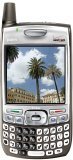
 After two years with a Palm 600, I now have a Palm Treo 700p Smartphone.
The phone has all the good things we have come to expect from Palm: a high resolution color screen, exceptional battery life, and of course the Palm OS.
What hasn't changed is the weight and thickness of the Palm 700p. This phone is a brick! Couple that with the Seidio Crystal Case that I'm using, and it definitely is a phone that you know is in your pocket. (The case protects it from biffs when it's dropped, absorbing the impact and popping off. Dropping not recommended for long life though).
Given how slim the Motorola Q Phone
 and the Blackberry 8700
 are, why hasn't Palm been more aggressive with slimming the phone down?
OK, that's my only gripe. The Palm 700p is easy to use, and with a memory card, capable of holding a selection of images from iPhoto, four translations of the Bible, several books and some tunes if you wish.
I highly recommend the following accessories:
- Seidio Junior Desktop Cradle for syncing and charging
- Seidio Crystal Case
- Plantronics Bluetooth Headset 640
(This headset is small, discrete, and with the earbud sits in your ear comfortably, and does not fall off -- even when shaking your head or moving quickly. Not recommended for wearing while riding roller coasters though.
- Missing Sync (for Mac OSX, sorry Windows users!) This amazing piece of software lets me use my Treo 700p with Microsoft Entourage for Macintosh, automatically transfer photos from iPhoto and iTunes. A must-have.
